
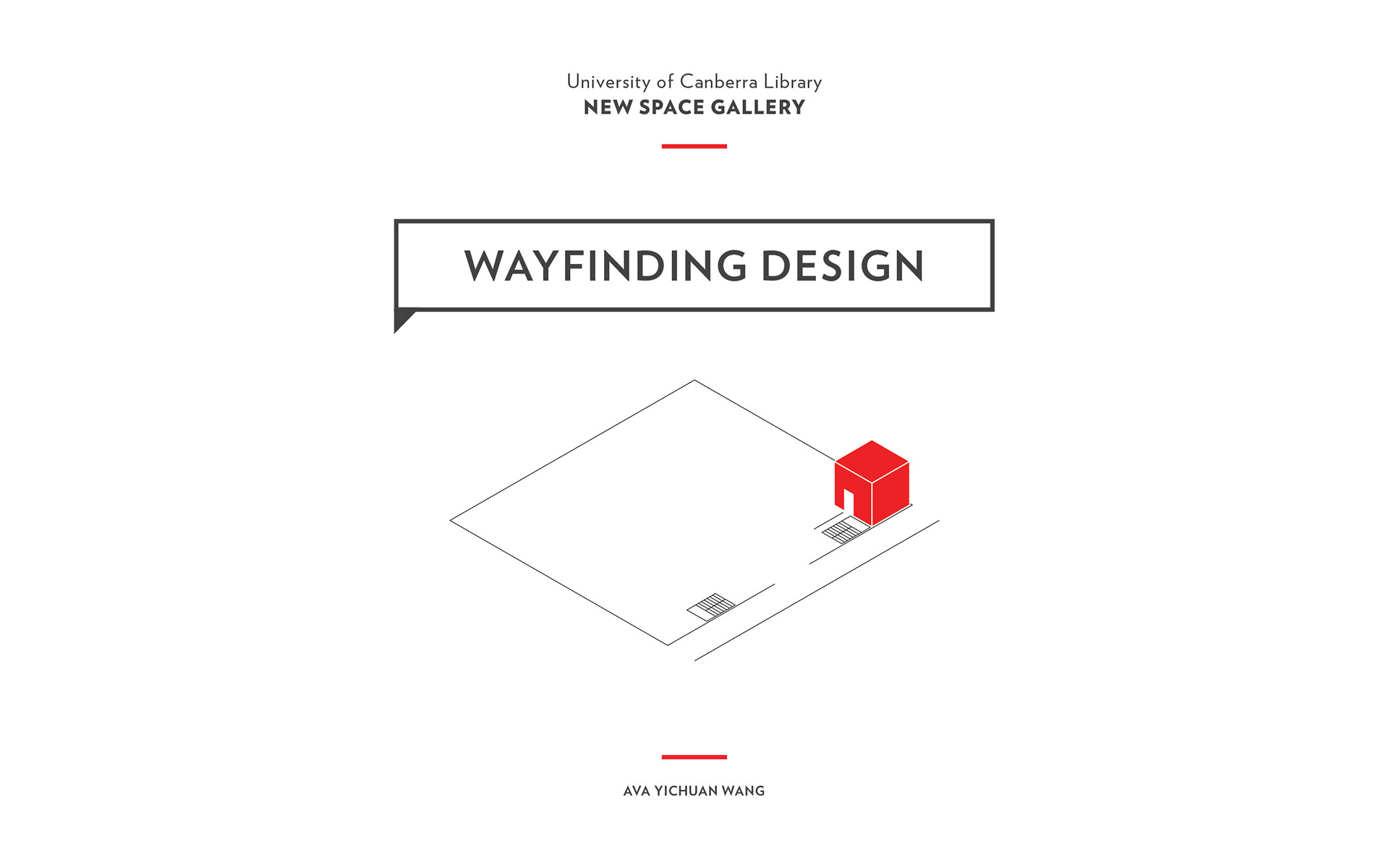
The New Exhibition Space
The site is located on the ground level of the University of Canberra (UC) Library, down in a narrow corridor where the male toilet is. The exhibition space is currently branded as Mura Gadi Gallery. It is a UC-owned small gallery exhibiting student, staff and community works of interest to the UC community. The client brief is outdated, stating that the site is new and under planning, the client did express their concern about the location and was seeking an innovative solution to presenting the site better.
My initial research finds Mura Gadi Gallery has a very low recognition among the targeted audience, UC students and staff members, and the gallery suffers low traffic.
Objectives
Therefore, this project is aiming to improve the overall performance of the site, increase traffic, improve the recognition and visibility of the site through a strong identity and effective wayfinding system. In-depth research conducted, problems identified, and the design solution is then crafted carefully to tackle each problem.


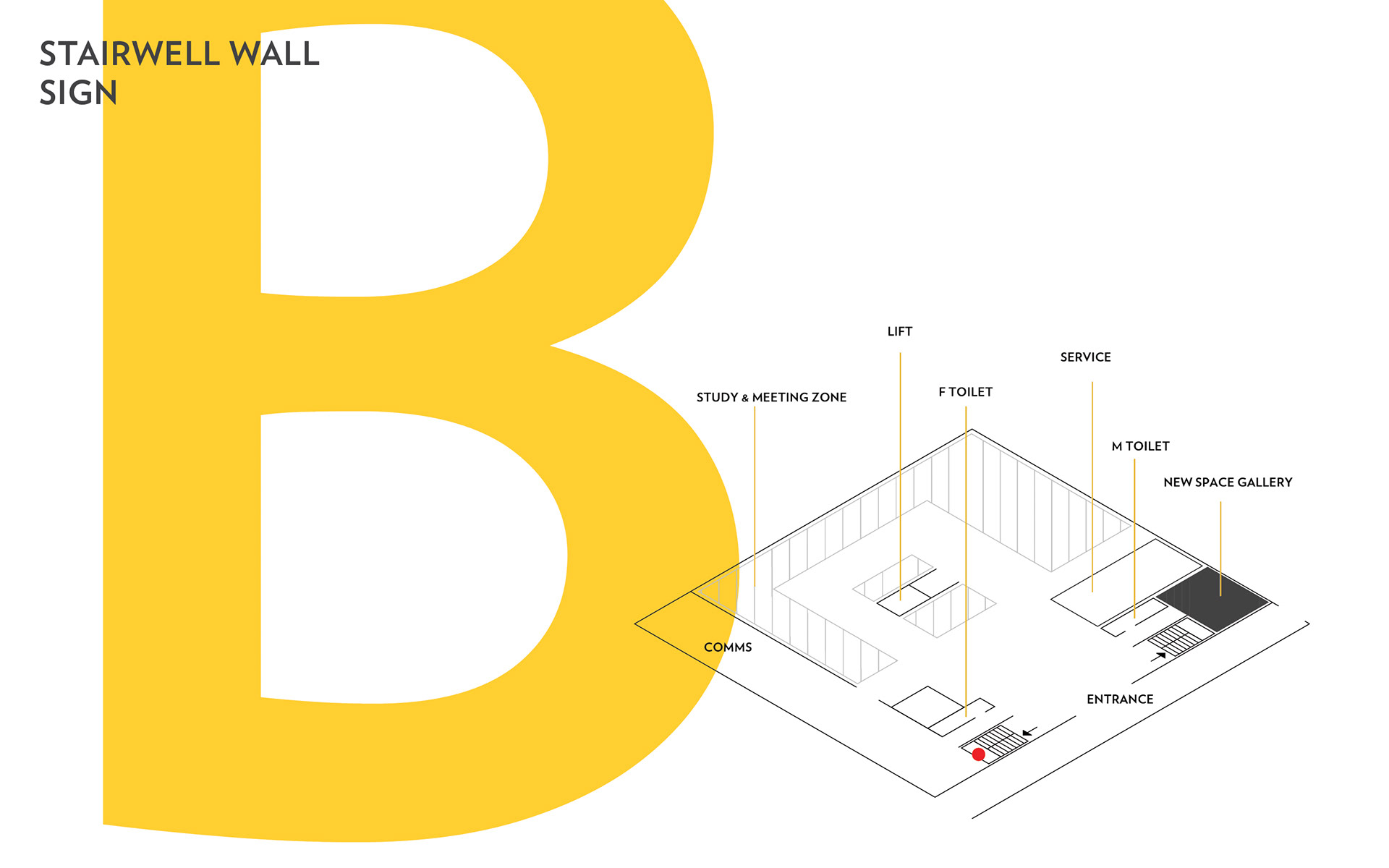
Rationale
This wayfinding project is approached comprehensively, carefully considering the physical environment, client’s requirements and the library culture, as well as the user needs.
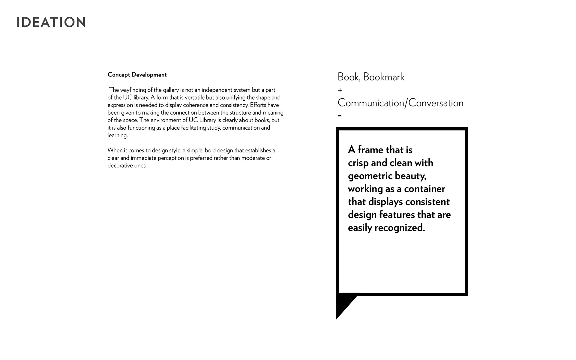
The book /conversation box container concept is intelligible, and in its expression serves as a clear unifying visual language to connect the library environment, its function and the people.
The book /conversation box container concept is intelligible, and in its expression serves as a clear unifying visual language to connect the library environment, its function and the people.
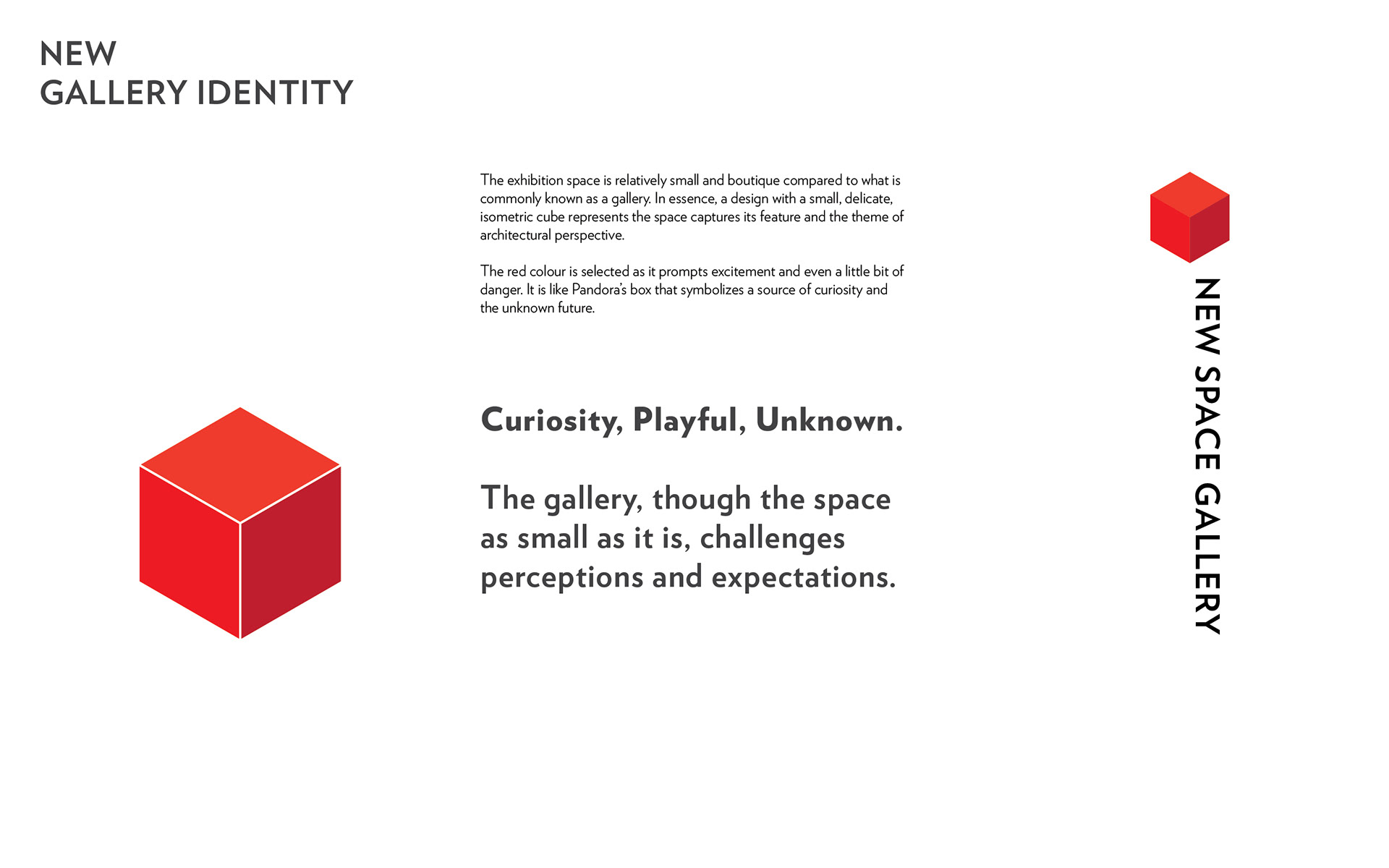
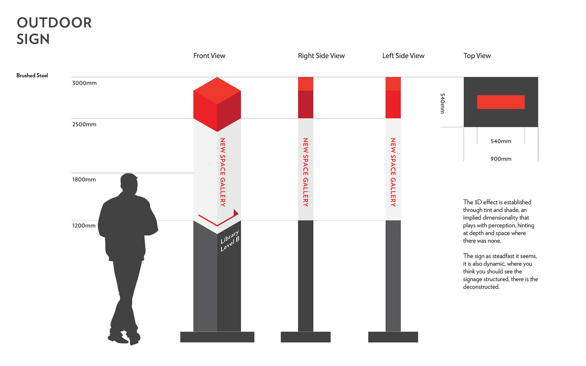
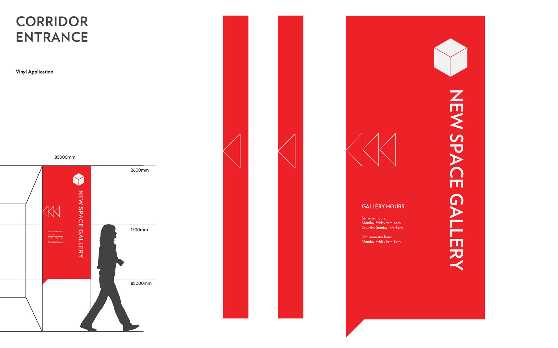
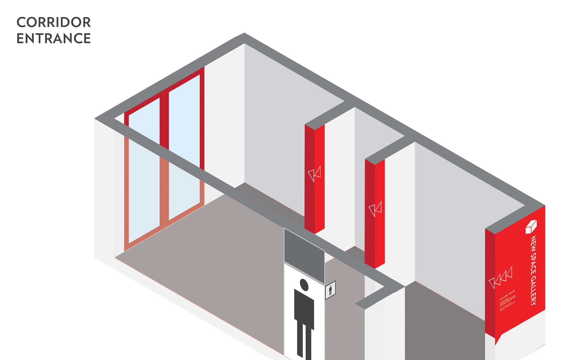
The new identity of the branded space presents itself with mysterious attractiveness - especially the outdoor sign, which constructed with tricky perspectives that give users an impression of excitement and prompts motivation to visit the site.
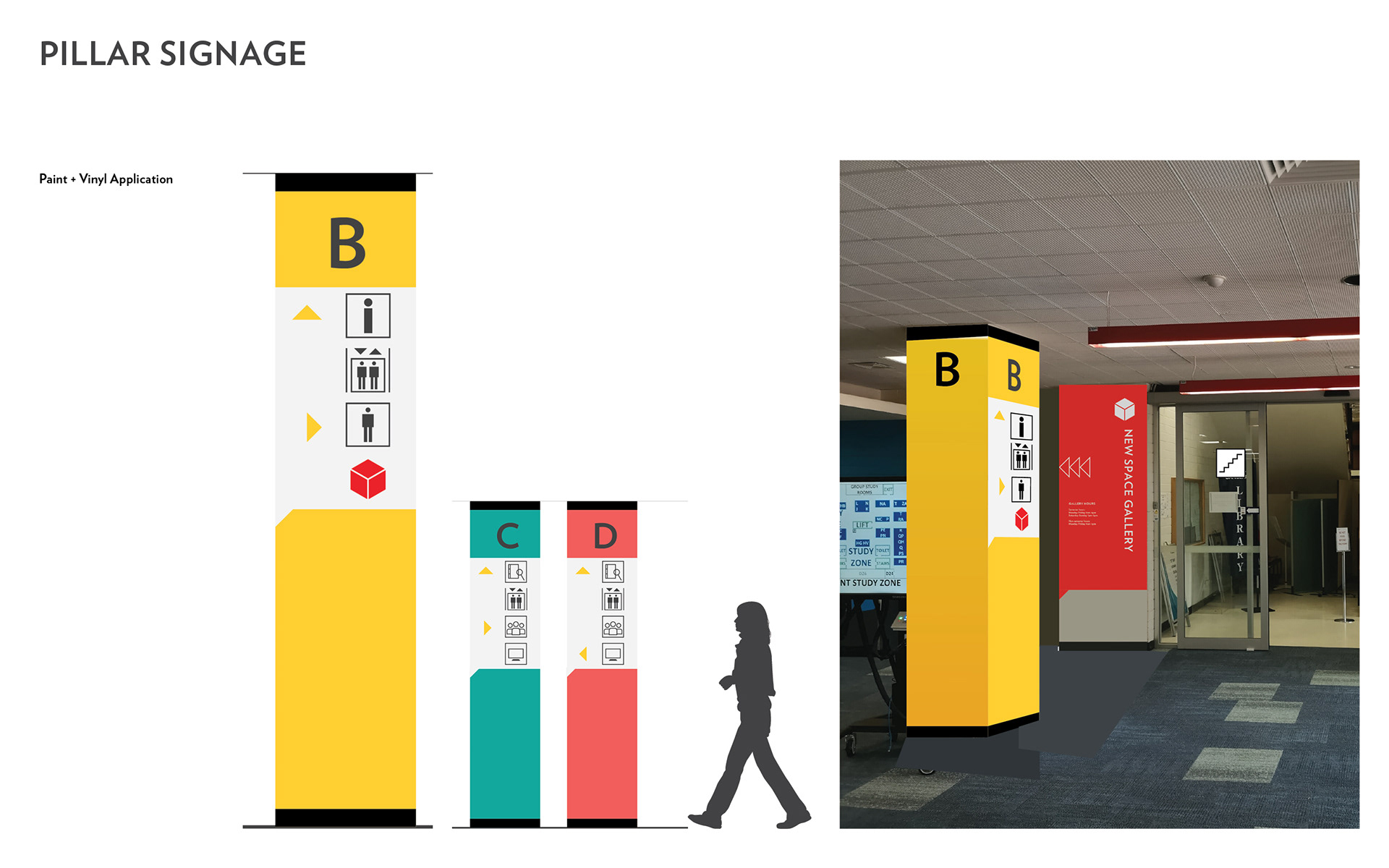
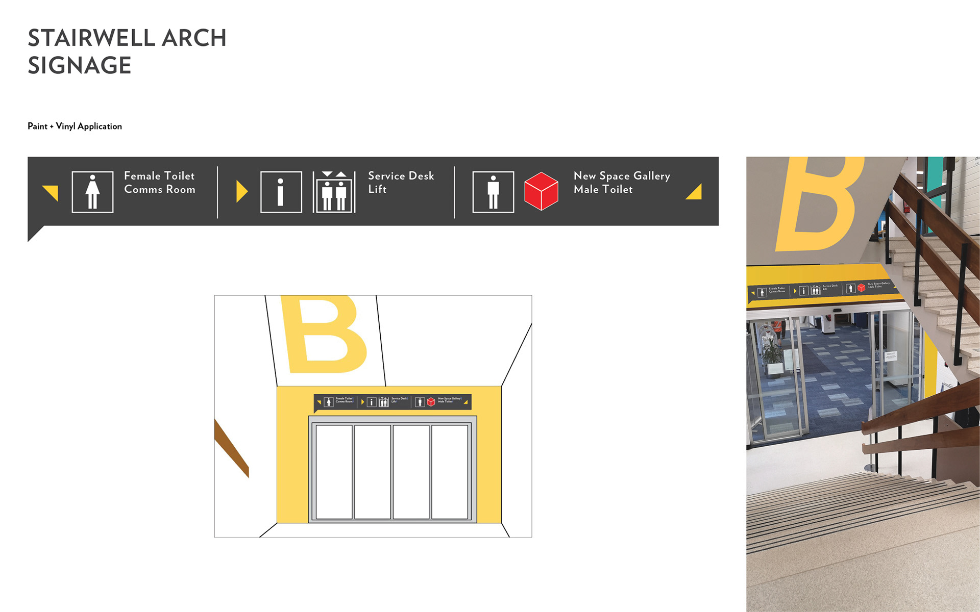
The design appears straightforward to implement, and it certainly has a spirit of modernity. The majority of the signage can be completed with vinyl wall application, a smart intersection of modern graphics and enduring interior architecture. This is not only in response to the client’s budget concern but also a gesture for a minimal design that is welcomed by the targeted audience.
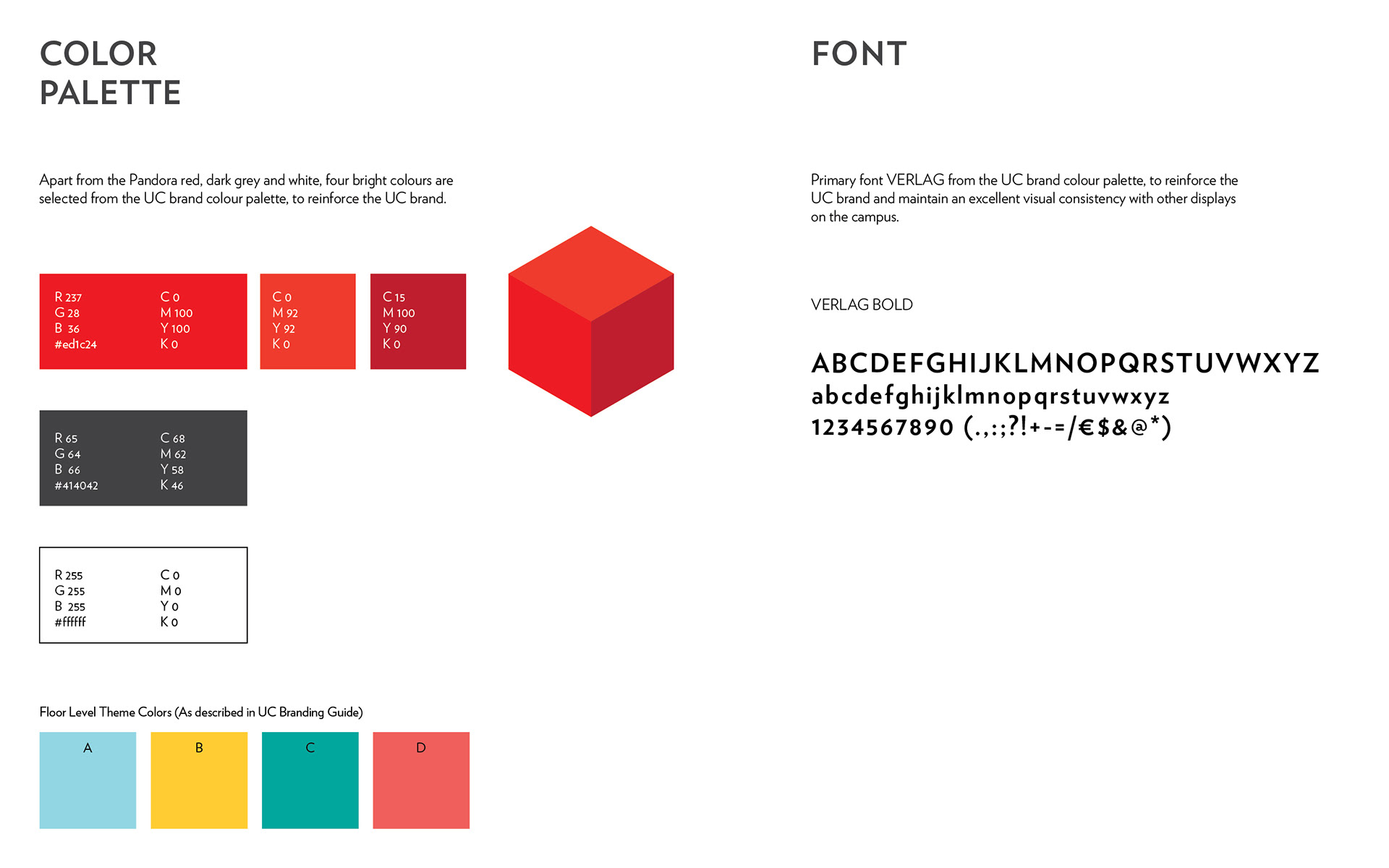
Bright colours are used for themed floor colour to give a lively impression. The simple application of big letter and colour block beams essential information straight into the eye without routing it through descriptive circuits. Such directness not only is a pleasant thing but also fits well with UC as a young university and its library’s vibrant study environment.
The design appears straightforward to implement, and it certainly has a spirit of modernity. The majority of the signage can be completed with vinyl wall application, a smart intersection of modern graphics and enduring interior architecture. This is not only in response to the client’s budget concern but also a gesture for a minimal design that is welcomed by the targeted audience.
Bright colours are used for themed floor colour to give a lively impression. The simple application of big letter and colour block beams essential information straight into the eye without routing it through descriptive circuits. Such directness not only is a pleasant thing but also fits well with UC as a young university and its library’s vibrant study environment.
The result is consistent and cohesive, with signs are placed in consistent, predictable locations and are Large enough to be read from a distance/decision point. It will help with increasing foot traffic to site and better user experience of visiting.
Overall, the project has been processed with effective wayfinding strategies that integrate signage and architectural elements with the built environment to make navigating the library and the gallery intuitive. The result is a truly as is signage system that is suitable, and responding to the client needs.
If you like my work or feel like working with me let's GET IN TOUCH